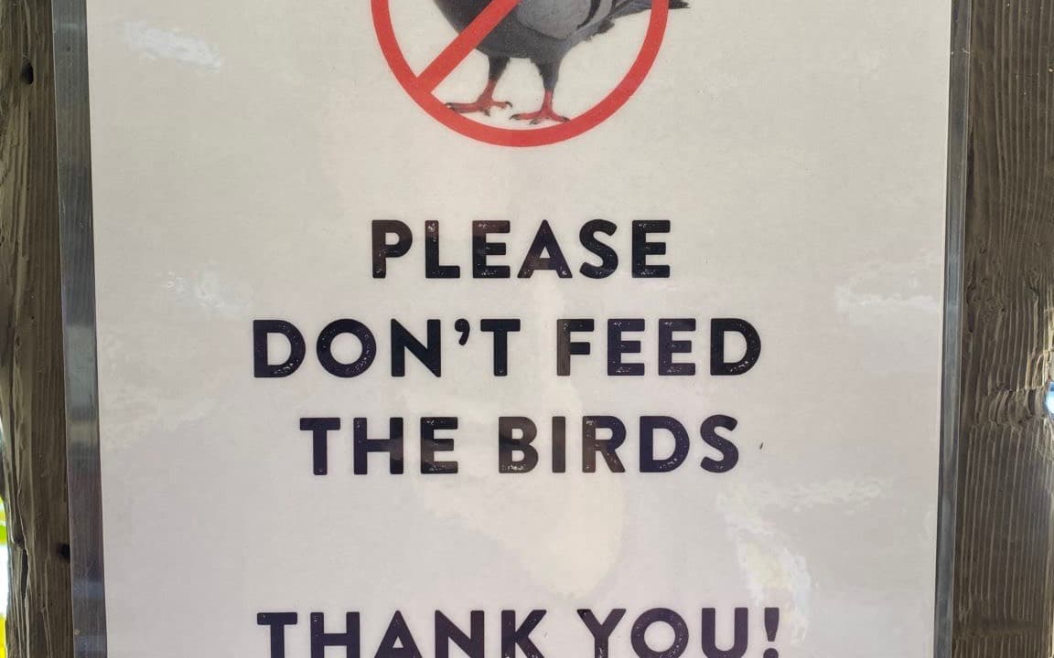
Please don’t feed the birds. Thank you!
Friendly enough—if you only read the words. The top of the sign is a pigeon with a Ghostbusters-style “no” through it. Technically it is a prohibition symbol. In practice it reads as no pigeons.
The copy is asking a person to stop doing something. The graphic is scolding the bird.
We are supposed to understand that the pigeon stands in for all birds, and that pigeons are probably why the sign exists. Fair. They are professional food-seekers. The mismatch still matters. If you only see the icon, birds are not allowed. If you only read the text, please don’t feed them. Those are not the same instruction.
The picture should be a hand spilling seed, with the same “no” through it. Prohibit the action, not the pigeon.
The takeaway
Copy and UI have to agree. If they don’t, people follow whichever is louder, and you may have banned the wrong party. The same thing shows up in empty states, error messages, and settings toggles: the label is polite, the icon is a stop sign, and nobody is quite sure what they are allowed to do.